12 Best Thank You Page Examples To Boost Conversions
Last Updated: April 22, 2024 by Onder Hassan

Thank you pages can be used in many ways and can help boost conversions and maximise your revenue potential.
Thank you pages can be used in many ways and can help boost conversions and maximise your revenue potential.
In this article, we'll discuss the benefits of using a thank you page, and we'll review 12 best thank you page examples highlighting whats good to help you create an effective one.
Learn What's Working Now from 120+ Top Landing Pages in our FREE Guide
Get Access to 120+ Landing Page Swipes from Creators, Digital Marketers and Experts + insights and steps to boost your landing page conversions.
What Is A Thank You Page?
A thank you page is a web page that is displayed after a successful conversion, such as a purchase or sign-up.
It's important to have a thank you page because as it allows you to show your gratitude to your customers for their actions, and it can also be used to increase engagement and encourage future conversions.
Why Is A Thank You Page Important?
A thank you page is important because it's a final opportunity to make a good impression on the visitor and encourage them to take further action.
For example, if a visitor has just made a purchase, a thank you page is an opportunity to upsell them on additional products or services.
Getting a visitor to make a small commitment is the key to getting customers to buy. And a thank you page provides the perfect opportunity to take advantage of this.
Here are a few examples of how a thank you page can be used:
Thank You Page Elements
Thank you pages can be used in a number of ways, with many business owners and entrepreneurs coming up with new creative ways to take advantage of them.
Here is what a typical traditional thank you page for a lead magnet offer might look like:
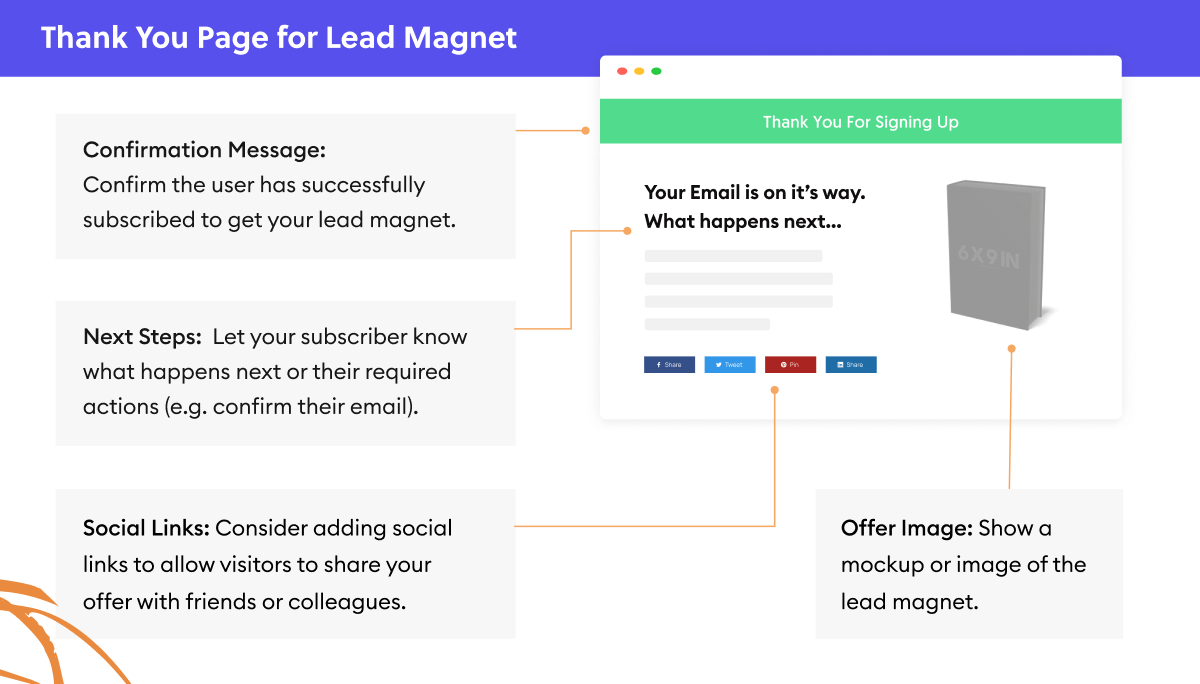
Confirmation: This is an affirmation to thank the visitor for signing up for your offer. It’s a polite way to spread goodwill and create a positive foundation for the relationship you’ll be building with your new subscriber and customer.
Image of the Offer: This is an optional element to include on the page but can be served as a reminder of what the subscriber signed up for and what they will be receiving.
Instructions: This is a short and direct headline that tells the visitor how to access their offer.
Description: This area of the page extends the instructions by providing the visitor with steps on where to go in order to access their free offer. It can also be used to let new subscribers know what to expect from you in the future.
Social Links: Lastly, this area can be used to promote other things such as links to your social media pages. This can also include bonuses, links to your more popular blog articles or tripwire offer.
Thank You Page Examples
We’ve compiled a list and analysed 12 of our favourite thank you page examples to help you come up with your own creative ideas.
1. Storybrand - Grow Your Marketing Business Checklist
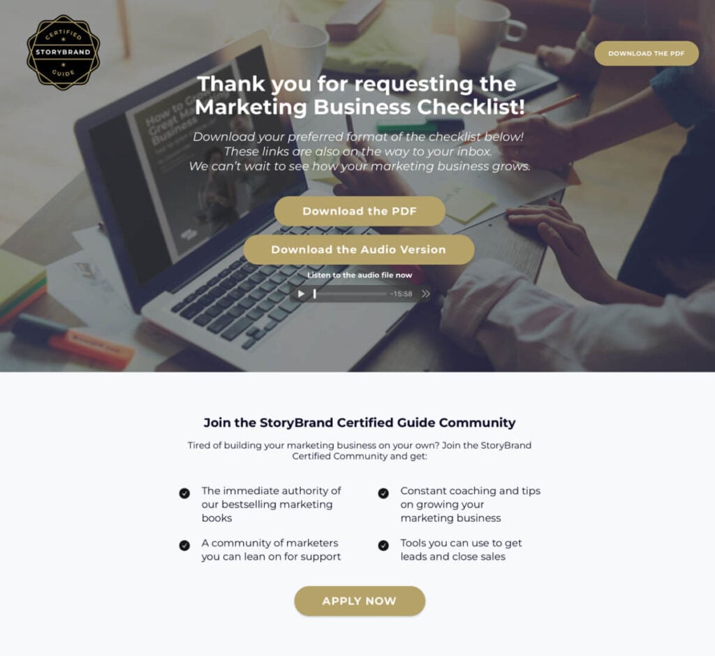
In this example, Storybrand uses a thank you page template that thanks the subscriber for opting in for the free offer and is also greeted with an offer to join their private community.
What is interesting to note here is that they have also included a background image of a working environment and a laptop, which helps set the scene for what the offer is about.
If you’re providing a service or something intangible, it is a great way to create tangibility for what you’re offering.
What we liked:
What can be improved:
2. Brian Moran - Going Pro Gameplan
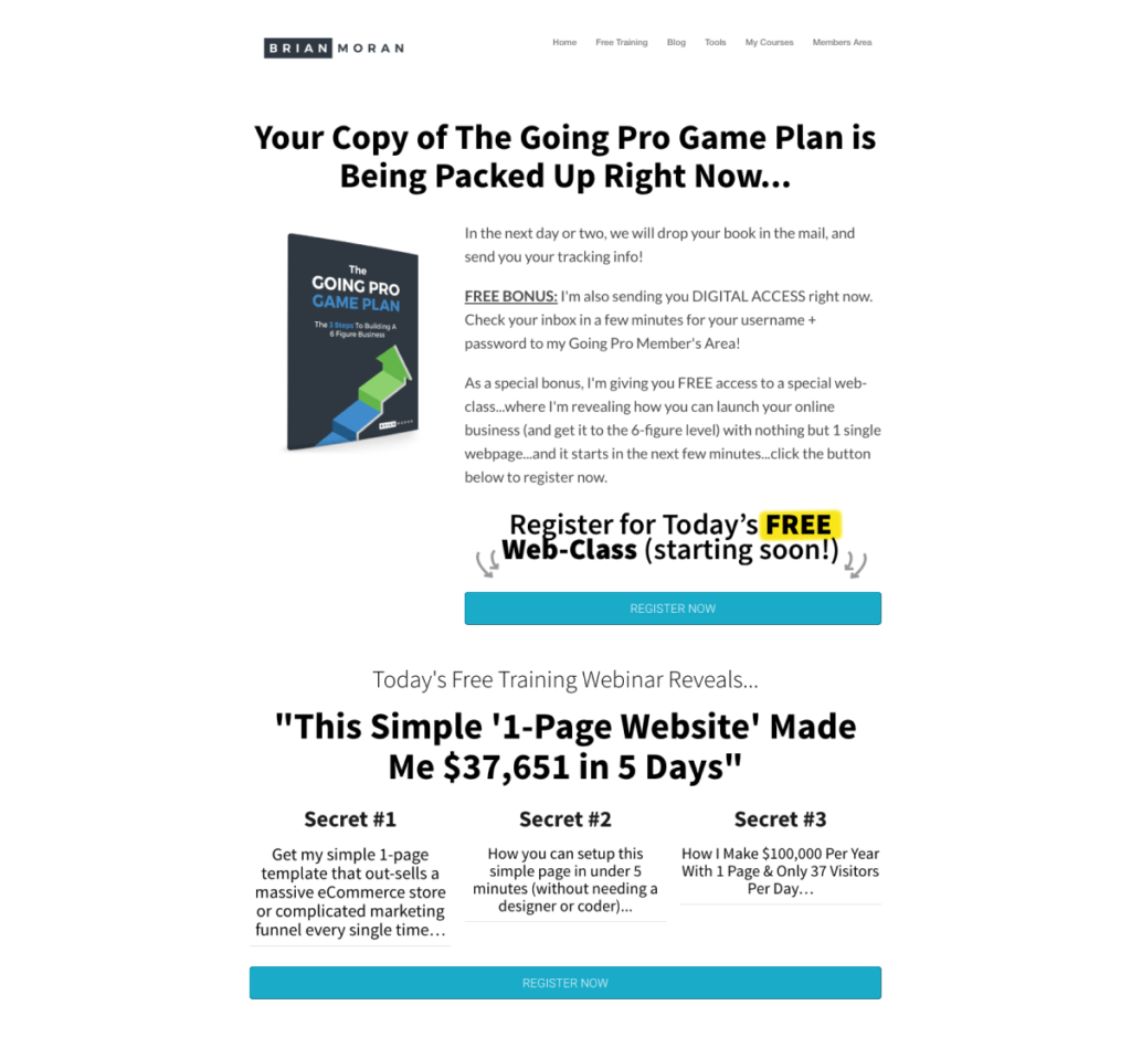
In this example, Brian Moran uses a traditional Thank You page with a twist…
He adds a bonus webinar offer as a goodwill gesture for his subscribers opting in.
This is another great demonstration of building a strong foundation with your subscribers, which will pay off later when you eventually go on to promoting paid offers.
What we liked:
What can be improved:
3. Davina Schorle - Selling Into Corporate Guide
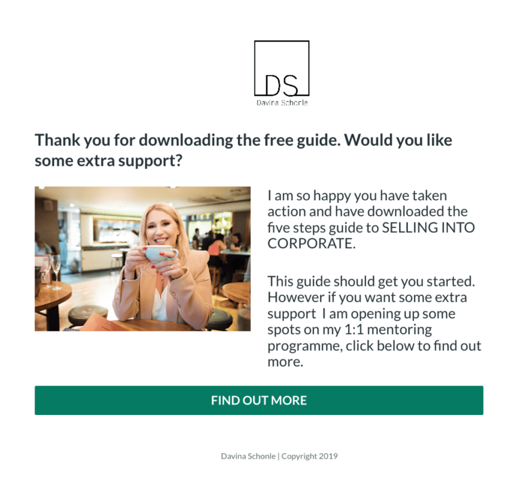
Davina Schorle has opted for a thank you page that shows you don’t need a complicated page in order to get the most out of it.
In this example, she briefly describes her offer and softly upsells her 1:1 mentoring program with a basic CTA on the bottom.
There are very few distractions on the page and gives the visitor clear instructions for what to do next.
What we liked:
What can be improved:
4. Scott Oldford - The Nuclear Effect
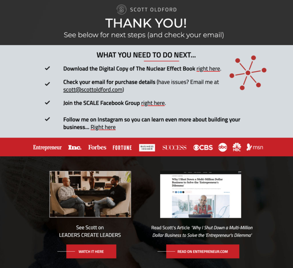
Here’s an example by Scott Oldford who chooses to include links to relevant videos instead of links to social media pages.
Further illustrating the flexibility of a thank you page. He also chooses to use bullets to help instruct his new subscribers on what to do next, which makes the instructions more simple to read.
If you have a lot of content you would like to include on your page, then consider using bullets to help break down the content and make it easier for your visitors to consume.
What we liked:
What can be improved:
5. Amy Porterfield - Online Marketing Expert
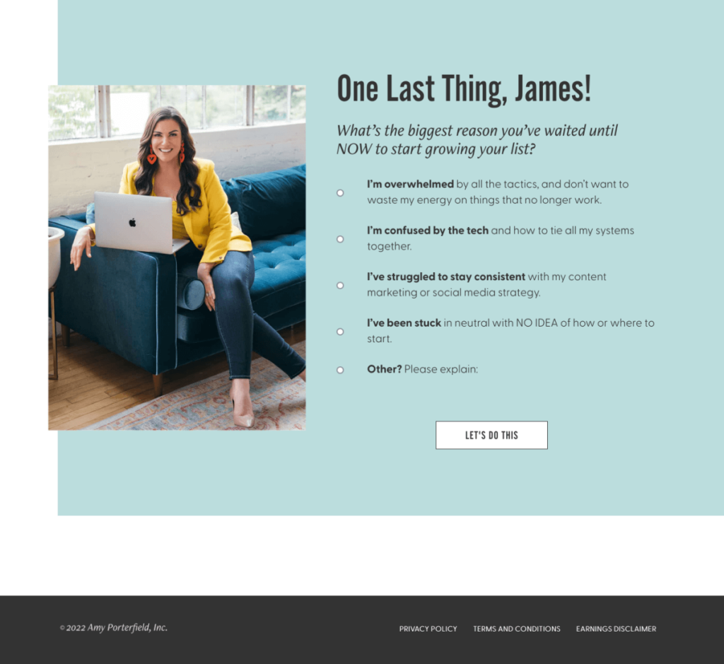
Amy Porterfield provides another example to show how versatile using bullet points can be in order to save space on a page.
She uses clear instructions to tell her subscribers what to do next and uses bold font to highlight key areas of text.
If you're running a personal brand, then you may also want to include a professional image of yourself in order to establish a more human-to-human connection with your subscribers.
What we liked:
What can be improved:
6. Brad Bizjack - Success Accelerator
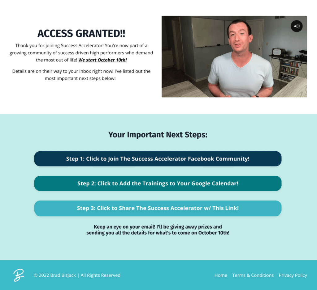
In this example, Brad Bizjack uses video to directly thank his subscribers to opt-in to his offer.
While using text is a nice way to communicate with your subscribers, using video allows your visitors to see you talking directly to them.
It will go a long way in building trust and provide a more solid foundation for the relationship you will build with them later.
He also neatly lays out what they need to do next using bullets that are colour coded and easy to understand.
What we liked:
What can be improved:
7. Kim Constable - The Million Dollar Mentor

Kim Constable for her thank you page uses a large headline that sits front and centre of the page that provides confirmation of their successful signup.
She also uses a 3columned row to evenly organise her content, which she does very well and saves a lot of space on the page.
This is another example of a traditional thank you page but can clearly see how different the design is compared to the earlier examples shown earlier.
Do not be afraid to use a design style that best fits your brand as this will provide congruency across your website.
What we liked:
What can be improved:
8. Grant Cardone - 10x Business Workbook
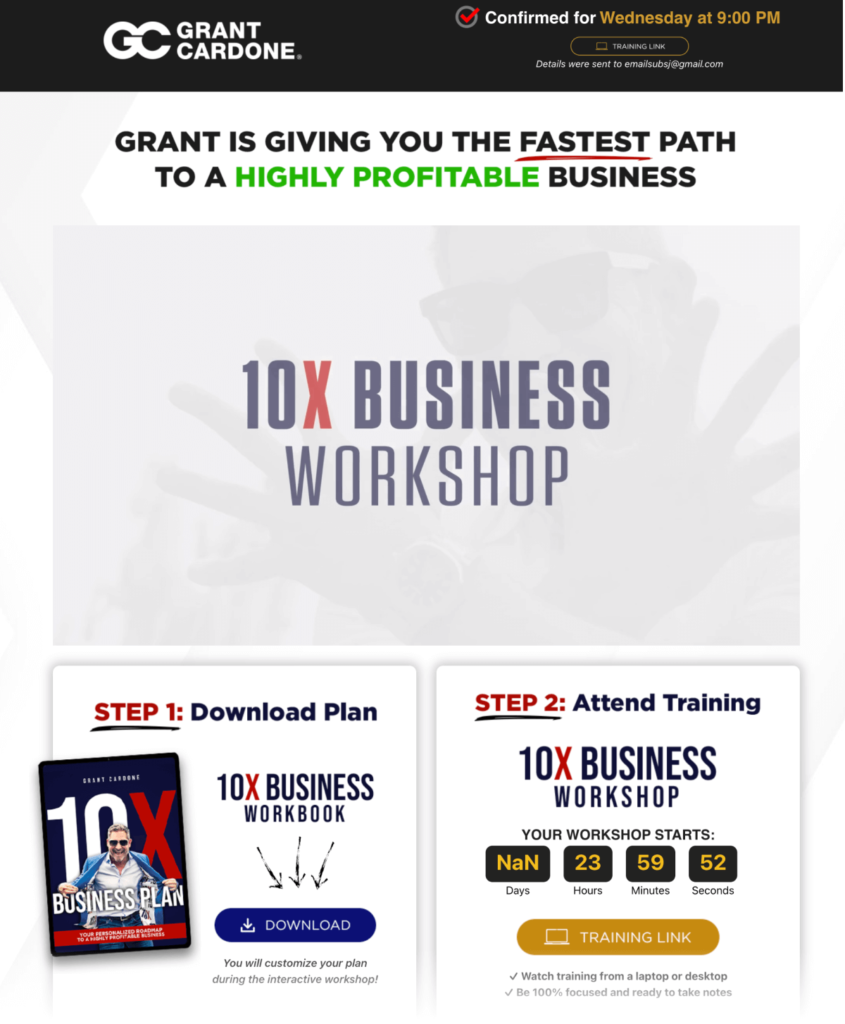
This is another great example of a well-organised thank you page by Grant Cardone using columns to help split the content.
The left column below the thank you video offers the free lead magnet that the subscriber opted in for, with the right column reserved for upselling another offer.
Below the page is reserved to introduce Grant Cardone with instructions on what to do moving forward. Again a nice example of a very well-laid-out page.
What we liked:
What can be improved:
9. The Sacred Plant Thank You Page

The Sacred Plant Thank You Page uses a long-form style which contains a lot more text and detailed instructions.
The content is laid out as a step-by-step guide to help the subscriber with the next steps.
This is another way to build a strong foundation and establish a good relationship as it demonstrates care and attention.
If you have a free video course on offer and require more text to help guide your subscriber. The long-form style of thank you page may be the template to use.
What we liked:
What can be improved:
10. Ramit Sethi - I Will Teach You To Be Rich
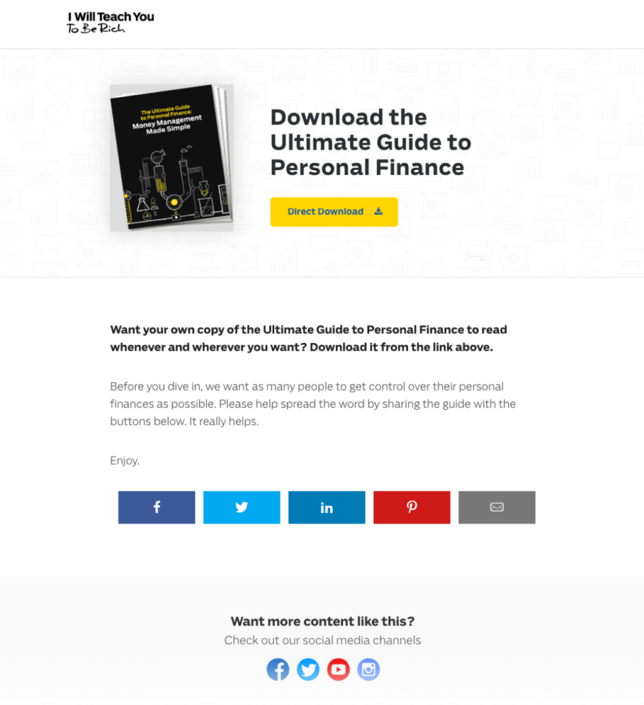
This thank you page by Ramit Sethi demonstrates how you can make your offer go viral by encouraging your subscribers to share it with their own audience.
As well as providing a link to the free offer above the fold. He also includes a description to encourage his subscribers to share in order to spread his message.
It isn’t too pushy and is an excellent way to get more viral traffic back to your offers.
What we liked:
What can be improved:
11. Mindvalley - Holobody Masterclass
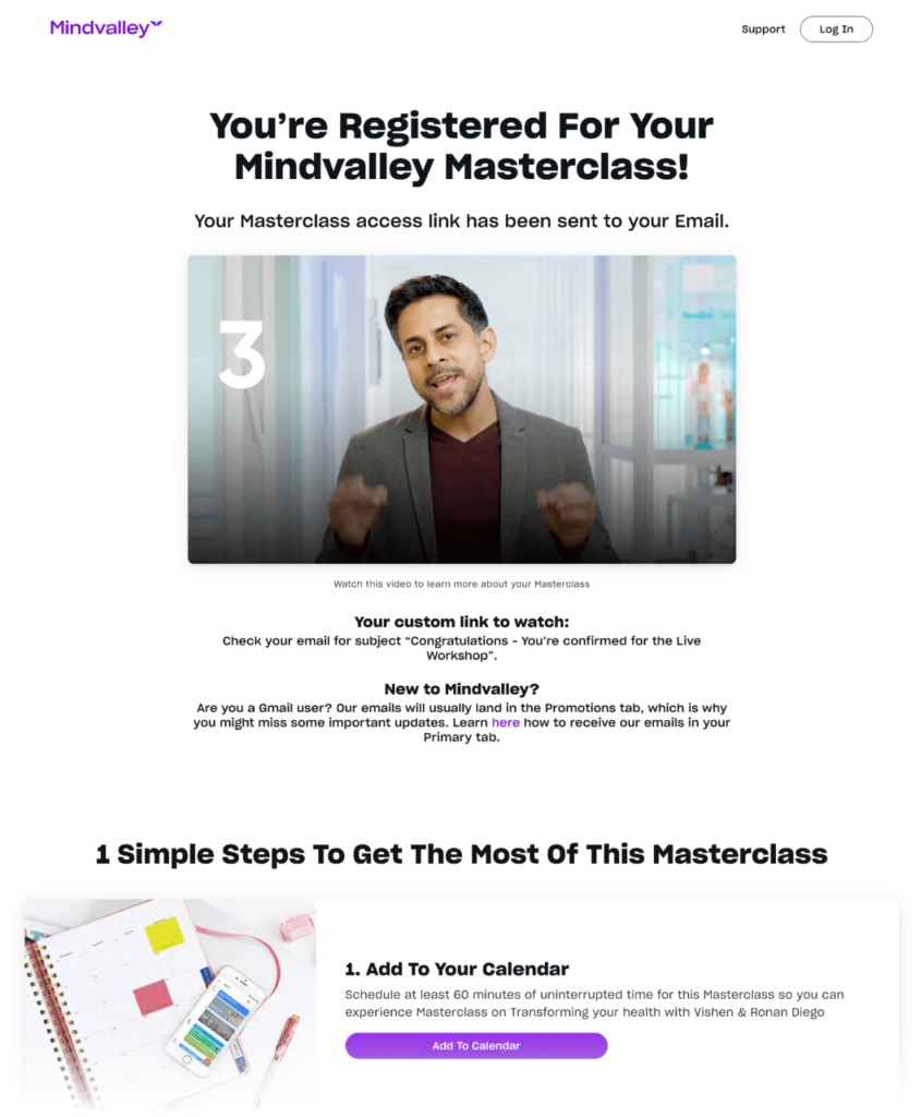
Vishen Lakhiani uses the power of community to build retention. Using a comment section at the bottom of the page creates social proof and endorsement from other subscribers about the quality of the offer.
It also removes doubt and improves the relationship. The subscribers is unlikely to unsubscribe or have any second thoughts about their decision due to their sense of being part of a dedicated group of like-minded people.
What we liked:
What can be improved:
12. Storybrand - The 5-Minute Marketing Makeover

Here’s a nice variation of viral sharing from Storybrand.
Unlike sharing buttons that were included in an earlier example. The subscriber is instead shown a form to fill in of anyone they might know that would find the offer interesting.
This is a very powerful alternative as it allows the author of the page direct access to the person that is referred to them by the subscriber.
What we liked:
What can be improved:
Key Takeaways For Building An Effective Thank You Page
With just a few guidelines, creating a powerful thank-you page isn’t difficult to set up and will be able to quickly get started with maximising your offers and services.
Here are the key takeaways to keep in mind:
With our OptimizePress landing pages and template library, you will be able to choose from a large selection of professional and high converting thank you pages so you can get up and running quickly.

Learn What's Working Now from 120+ Top Landing Pages in our FREE Guide
Get Access to 120+ Landing Page Swipes from Creators, Digital Marketers and Experts + insights and steps to boost your landing page conversions.
Leave a Reply
Ready to experience the OptimizePress difference?
OptimizePress is the leading funnel builder and landing page builder that is affordable and designed for solopreneurs and founders who need to get their pages live fast.
30 day money back guarantee




2 replies to "12 Best Thank You Page Examples to Boost Conversions"
Thank you for sharing this informative article about the importance and examples of thank you pages. I found the list of 12 thank you page examples to be particularly helpful, as I am in the process of creating a new website for my business. The tips and elements you mentioned, such as confirming the visitor’s action, providing clear instructions, and promoting related products or services, are very useful. I will definitely consider these while designing my thank you page. Overall, a well-designed thank you page can not only show gratitude to the customer, but also help increase engagement and future conversions. Great job on the article!
Hi there, Thank you so much for sharing 12 Best Thank You Page Examples with us. Its give me a good idea.