Ultimate Guide to Landing Page Trends
Updated 7th February 2021
For all small business owners, coaches and e-commerce stores it’s time to start preparing for the landing page trends that will evidently boost your list building power and create a strong marketing machine for the years ahead.
All businesses need leads and a way to promote new offers. This usually starts with a landing page no matter if you have a lovely design shopping cart or beautiful home page for your yoga studio.
A landing page reduces clutter and allows you to focus your visitor on the one desired action you want them to take.
But before you jump off and start building a new page, we've pulled out the OptimizePress Crystal Ball (TM), and analysed what we think will be the biggest landing page trends of 2021.
Trends come and go, so you obviously don't need to use all of these in your business. Just be aware of these as you design and develop your pages to ensure you stay relevant in 2021 and beyond.
Remember this, many of these trends can be applied to most niches and almost any type of business whether you are collecting leads on a capture page or selling a product on a sales page.
Your landing pages and sales pages should have one objective. Bear that in mind and try out a few of these strategies to see how they work for your business. Read on to learn more.
Chapter 1

Page Speed
The loading speed of a website has been at the forefront of Google’s algorithm updates for years.
It’s a primary factor for SEO, and is why Google produce content and provide tools to help you make your page fast!
However, things can get a little sticky here.
While you might think you have a fast page, until you run it through a page speed tool you’ll never know what Google sees.
Your browser might cache a version of your own page so it’s loading fast for you at home but for a visitor on a mobile device, they might experience the feeling of watching paint dry as it loads.
⚡
Remember the golden rule of site speed optimization
Faster site speed equals higher conversions.
Also don’t be fooled by using WordPress page builders that bloat
your landing page with extra code. One way to check is actually viewing
the page source and seeing what scripts are running on your pages.
Our own landing page builder includes our special "blank template" format (we build all our templates on top of this). This special template strips out any codes and third party scripts to make your page super fast
Don't worry - you can still enable any scripts you DO want to use in the OptimizePress settings
This ensures minimum bloat from WordPress plugins that usually slow your site down.
Here's a speed test featuring one of our included landing page templates:
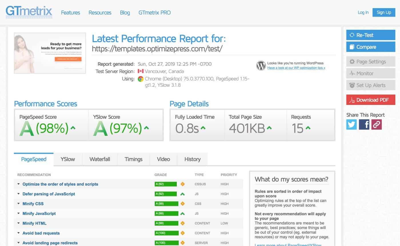
An example of a GTMetrix performance report for an OptimizePress landing page.
To
speed up your own page first run it through a tool like GTMetrix , Web
Page Test. You can also try Page Speed Insights - bear in mind that this Google based tool doesn't actually test server speed it only analyses your page code to give you a speed rating.
Once you have the result, these tools actually tell you what’s slowing down page and what to do to improve the result.
In
most cases, there are usually images dragging a page score down.
Remember to resize images to correct viewing size on your site. Don’t use
an image that’s 2000px wide but have it display 500px wide on your page.
Resize it first!
We also recommend using an image compressor software or a
plugin that compresses images after upload such as Imagify. This reduces the size of your images further, without affecting how they look to your visitor.
Another
primary culprit of page speed is a poor host. Good quality hosting
usually costs around $30-$50/month. This is when your website resides on a
server with only a small number of other sites.
Want to see what websites are hosted on the same server as you? Easy, do a reverse DNS lookup at: https://viewdns.info/reverseip
We recommend Kinsta (WordPress dedicated hosting) or Siteground (if budget allows - go for their Cloud hosting options). We use both of these providers for OptimizePress websites.
Why to consider OptimizePress
We optimize for speed in WordPress
If you're considering building your landing pages in WordPress, you need to know that WordPress adds a lot of "overhead" to your pages by default. This can mean slower times and more difficulty getting those top speed ratings in the tools we mention above.
When you use OptimizePress for your landing pages, you're using a platform that has been optimized for speed. We remove the unnecessary codes that WordPress adds, giving you the best possible performance in WordPress.
Get started with the brand new speed optimized OptimizePress platform today from only $99/year
Chapter 2

Adaptive Design
For a number of years now, Google has placed increasing importance on your websites being compatible with mobile devices, especially with the trend of mobile web traffic continuing to increase over traditional desktop traffic.
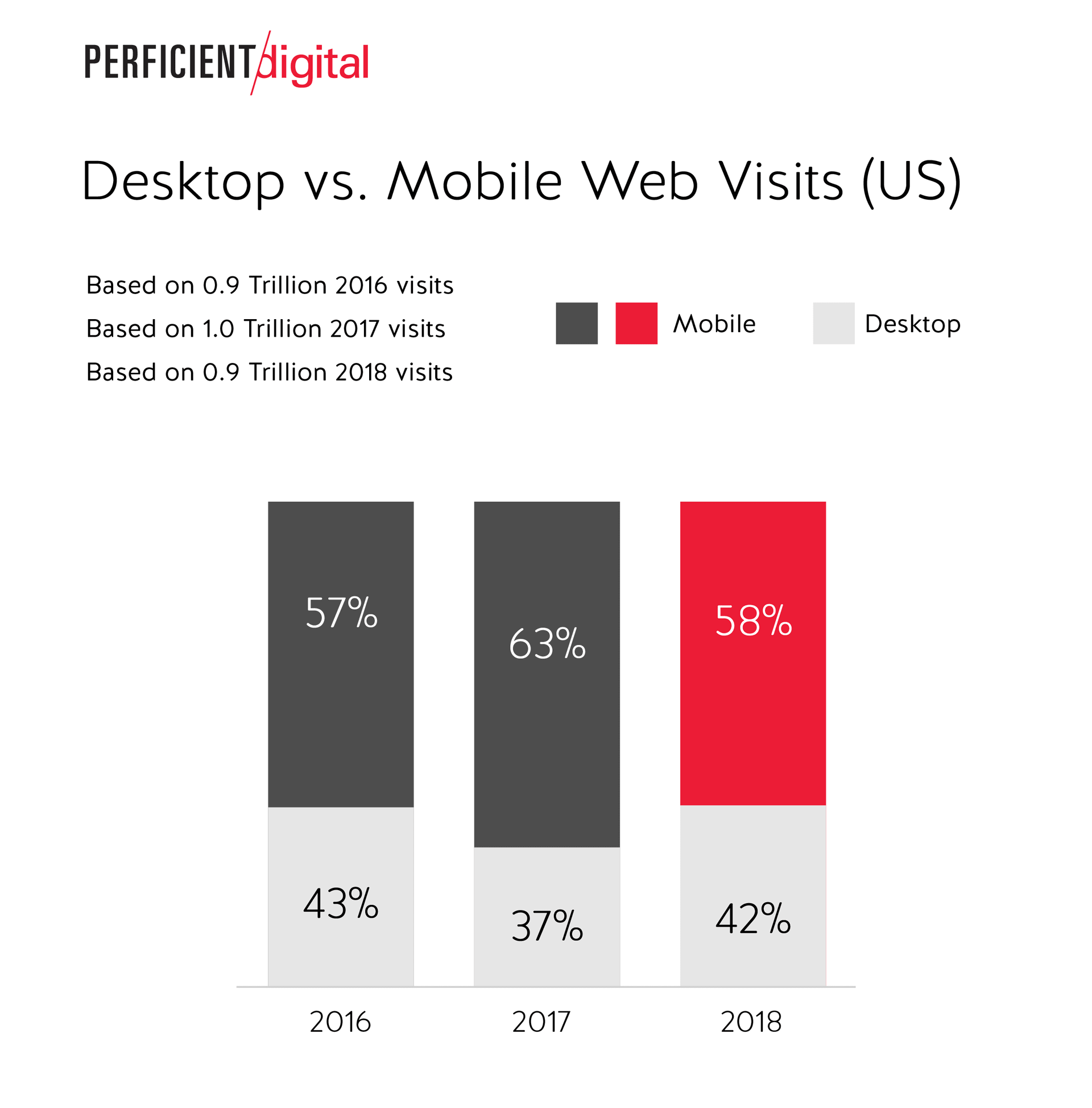
Source: PerficientDigital
Having a mobile responsive site is almost a standard requirement now (a site which scales down to different device screen sizes), but we're now seeing an increase in adaptive web design across landing pages.
Adaptive web design means that your site doesn't just scale to a smaller screen, but elements of the page are customized for specific devices or screen sizes.
This means a more optimized experience (and usually better conversions) on those mobile and tablet devices due to this customized experience for those visitors.
How to use adaptive web design on your landing pages
You might be thinking "this sounds way too complicated for me to use" but rest assured, with the right landing page builder, it's easy to start using adaptive web design.
The OptimizePress page builder allows you to easily customize elements of your page specifically on tablet and mobile views (more on that later).
A few things to consider starting with on your pages:
Background images and colours - Consider how your background images look on tablet and mobile views. If you have a full width stretched image covering the background, this may lose it's effectiveness on mobile devices. Consider removing this and choosing a solid colour instead to enhance readability.
Button sizes and text - Most of your page call to actions will involve buttons or links - so consider how these look on mobile. Consider making your buttons larger or increase the height of them for mobile devices so they are easier to click.
Input Fields - If you are using a form on your page (such as an opt-in form) you need this to be super clear and easy for your visitor to fill in. Consider making your text input fields larger (increase the height) to make completing these on a mobile device seamless.
Images & Element Placement - As your page scales from desktop to mobile, your columns will naturally stack to make your content easier to read (this happens with most mobile design frameworks).
You should consider the order in which these items stack. Often your content will be stacked with blocks in the wrong order - making your content harder to read.
With OptimizePress, you can reverse your columns order to re-order your stacked items and improve your content flow:
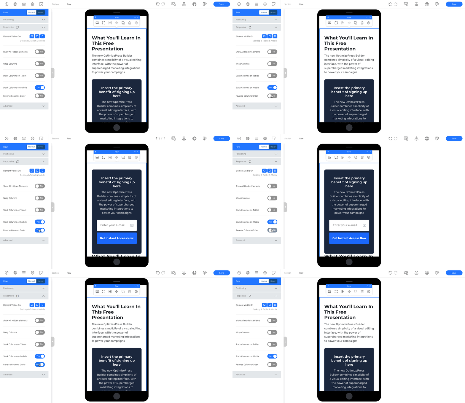
Reversing column order in our WordPress page builder.
Above the fold - You should always consider what content sits above the "fold" on your page. This is the content that a visitor sees before scrolling down your page.
This content should make an immediate impact, and where you have a landing page with a call to action, you should try and always include this in the above the fold section.
Doing this might mean that you need to hide some content on your page on tablet and mobile versions of your page - but this should help increase conversions for these mobile visitors.
Why to consider OptimizePress
Full responsive design control
OptimizePress provides you with full control over your website when it comes to desktop, tablet and mobile devices.
You can customize font size, spacing, padding and margins for desktop, tablet and mobile views independently. You can even show or hide elements on specific device/screen sizes, giving more advanced users the ability to create an almost completely custom experience on different devices
Get started with the brand new speed optimized OptimizePress platform today from only $99/year
Chapter 3

Specific Call to Action
A trend that will grow in 2021 will be using clear and specific Call To Action (CTA) for each individual page on your website.
Someone who lands on a fitness article about Abs workouts will convert better with a CTA focused around the fitness goals of the visitor.
Your CTA offer must be unique to the content they are viewing and not generic. This will seem more work but to get targeted leads you’ll need related lead magnets in multiple places throughout your site.
And a secondary CTA should be styled different from the first. This way you can grab people’s attention using different text and colours after they miss your first primary CTA.
See this example from alomoves - their primary button up top offers a free trial “Start My Free Trial”.
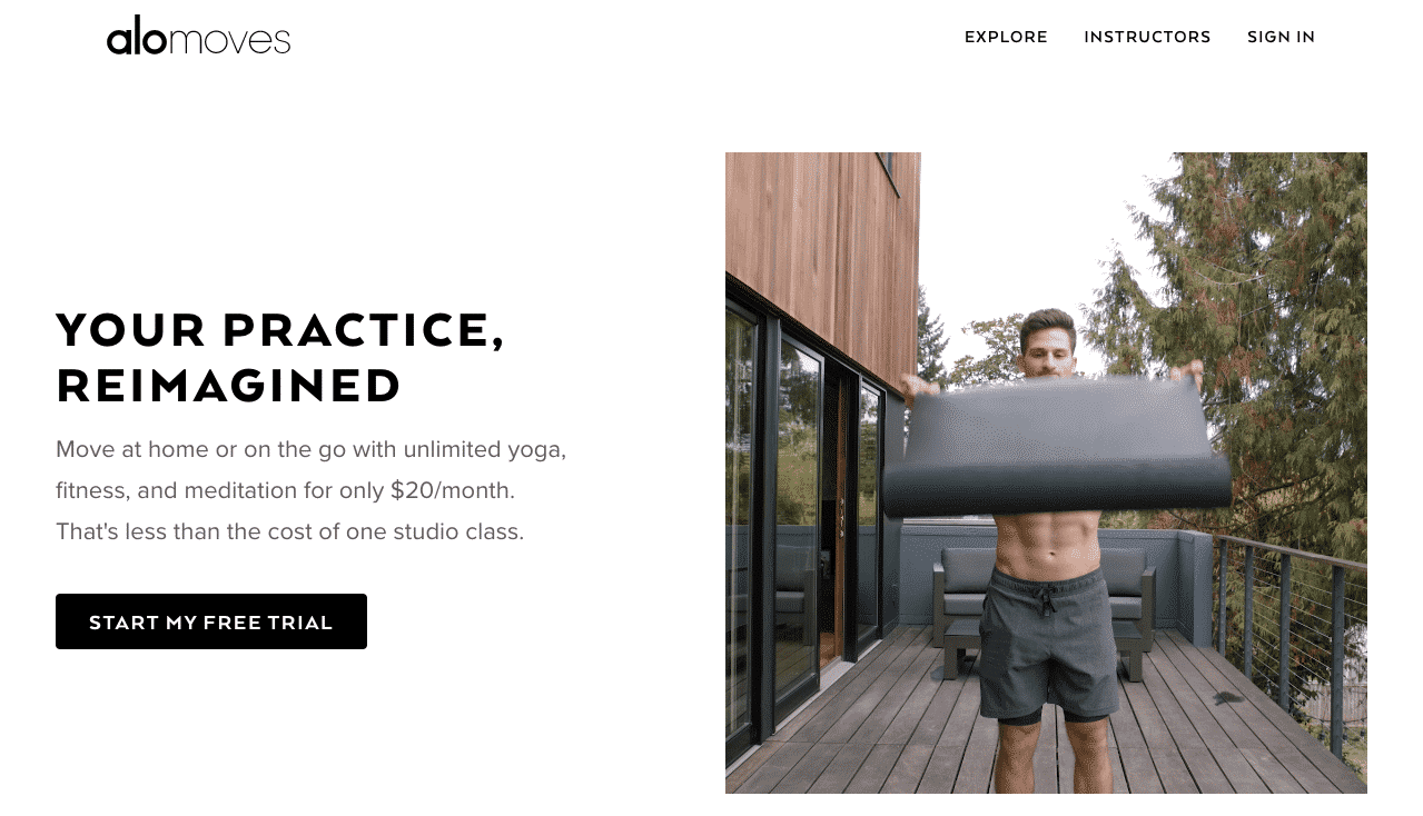
Source: Alomoves
Then at the bottom of all their pages they reverse the colour and use a large black CTA.

Reverse colour example from Alomoves
The CTA should provide helpful information that lets you later communicate with the prospect and make further offers. Think of it as a tool to help someone research you and your products.
Heard of the Ghost CTA?
We’ve been using this style of CTA for a while.
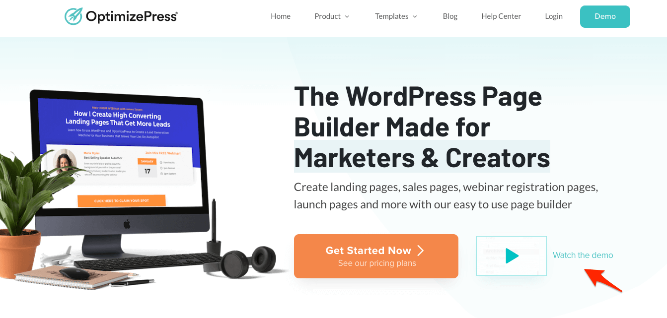
An example of the ghost cta on our OptimizePress homepage
You would have this on your landing pages design where one of the button is transparent and the other primary button is a solid colour. The idea here is that the people who are ready to take action follow the main button and those who want to learn more click the secondary “ghost” button.
Chapter 4

Hero Your Product
This ties in with page load speed. As soon as your page loads it needs to hook the visitors attention. Make it very clear what your product does and how it will solve the key issues for your visitor as soon as they arrive on your page.
Do not make them have to search around the page. You literally have just a few seconds to convince the visitors they are in the right place, right now. Show don’t tell.
In the hero section before they scroll any further you have to hero your product. Clearly show the solution it provides and the benefit that brings.
Chapter 5

Now/Show Demand
This is very relevant today and will still be an ongoing trend in 2021, it’s the use of timers and expiring offers but expect them to get more personalised throughout the marketing process. One feature we added to OptimizePress was an industry first feature that allows you to link timers across multiple marketing pages.
This means you can push more urgency to each individual user making it a personal experience on the journey of becoming a customer.
During the next year the goal will be getting people to take action much, much sooner by using expiring offers, linked timers, more linked fomo tools and finally heavier discounts to get a user to take action immediately when they see an offer.
We also want to show people the demand that there is for a product using proof of purchasing and other live data showing stats of people buying your products, volumes going down and other interactive sales performances.
The journey a user takes to becoming a customer will be a personal one that only they will see based on different triggers and times they see on your offers.
Chapter 6

Build Trust & Confidence
As you know showing trust is usually important on your pages sometimes you have seconds to show people you trustworthy business. However just showing testimonials is not going to be enough in 2021 we need to look further and deeper into showcasing people’s results, case studies from people who have used your product.
Start using other review sites like Capterra and Trustpilot embedding comments from Instagram and Facebook of people using your products and also showing the recency of people purchasing.

Close.io show review stars from customers.
Try and showcase the transformation people have after buying a product, this will build far more trust just having a written testimonial.
If can show people the situation that you were once in and to where they can get.
Example:
“I was like you but now I am this”
“Our company was struggling with X but now we don't have to think about it because of X”
Your visitors will relate to seeing other people who are or have been, in the same situations as them.
Making featured seen in sections on your pages is a priority along with ratings and reviews from sites will create more data points to help build trust and confidence for the person is researching your service or products.

Zoom trusted logo examples.
Chapter 7
Show Comparisons
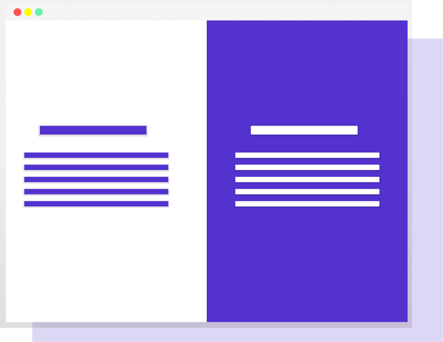
We feel here a big trend in 2021 will be showing customers comparisons of your business against other businesses. This is your chance to highlight key features and benefits of your products that your competitors don't have.
If you're concerned about highlighting your potential competition then you can create a comparison table that is laid out with all the solutions that you offer versus all the things that your competitor doesn't.
For example, let's say you charge $97 per year for your software but your competitor is charging 99 a month. You could create a comparison chart showing the pricing structure of your products and alongside it, you could show competitor pricing without giving away who your competitor is.
If you really want to win customers then showing the complete difference between your service and other platforms is a given. Look how Notion does it.
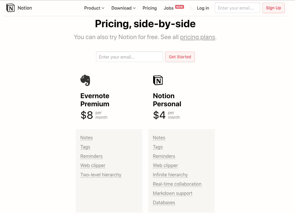
Notion side by side pricing comparison.
And if you only have one big competitor than heck, you need to make it clear.
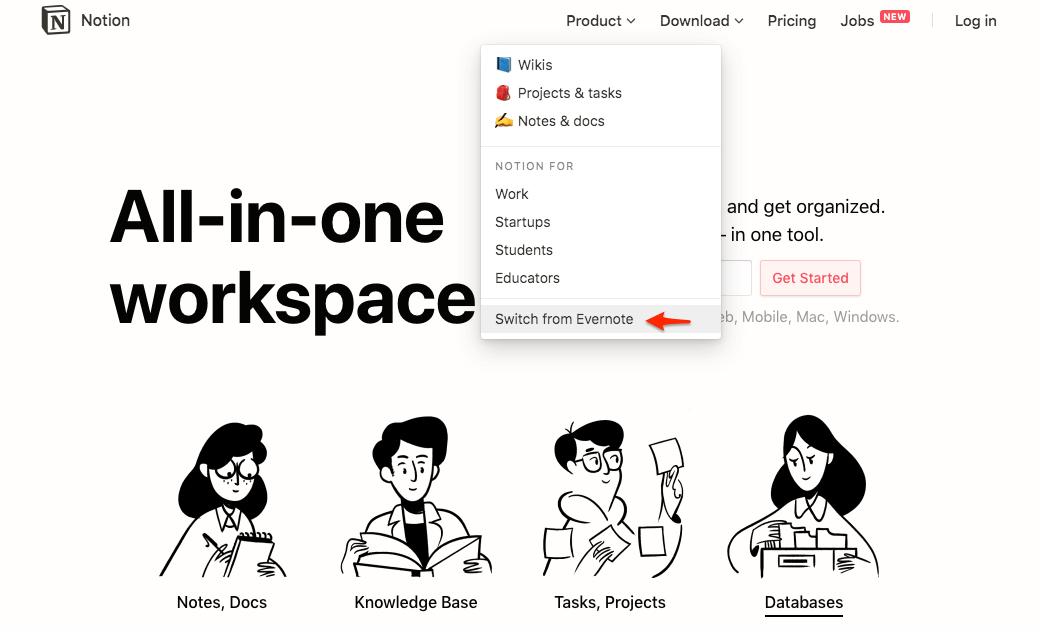
Notion's switch from Evernote example.
When people see your comparisons they naturally look for features and pricing that will benefit them. This is your chance to showcase your product as a winning product compared to a competitor.
If you wanted to target companies with the smalls sales team you could list that as something your product is more suited for. See how Close.io do it.
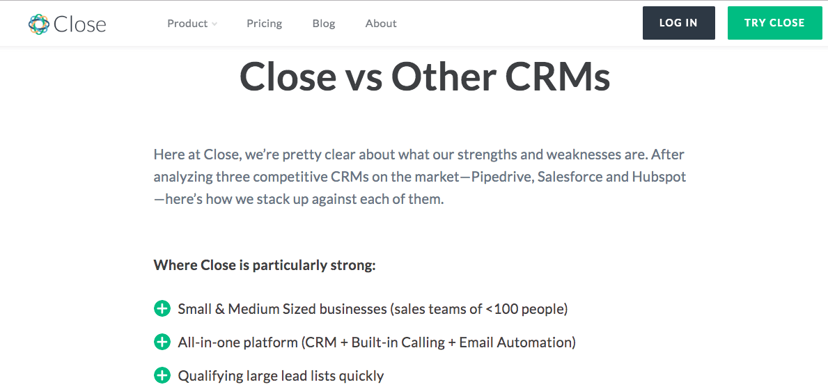
Close.io Vs Other CRMs
By showing the comparison table it allows you to educate your customer about all the features they may not be aware of and also features that they thought were available in competitor that aren't.
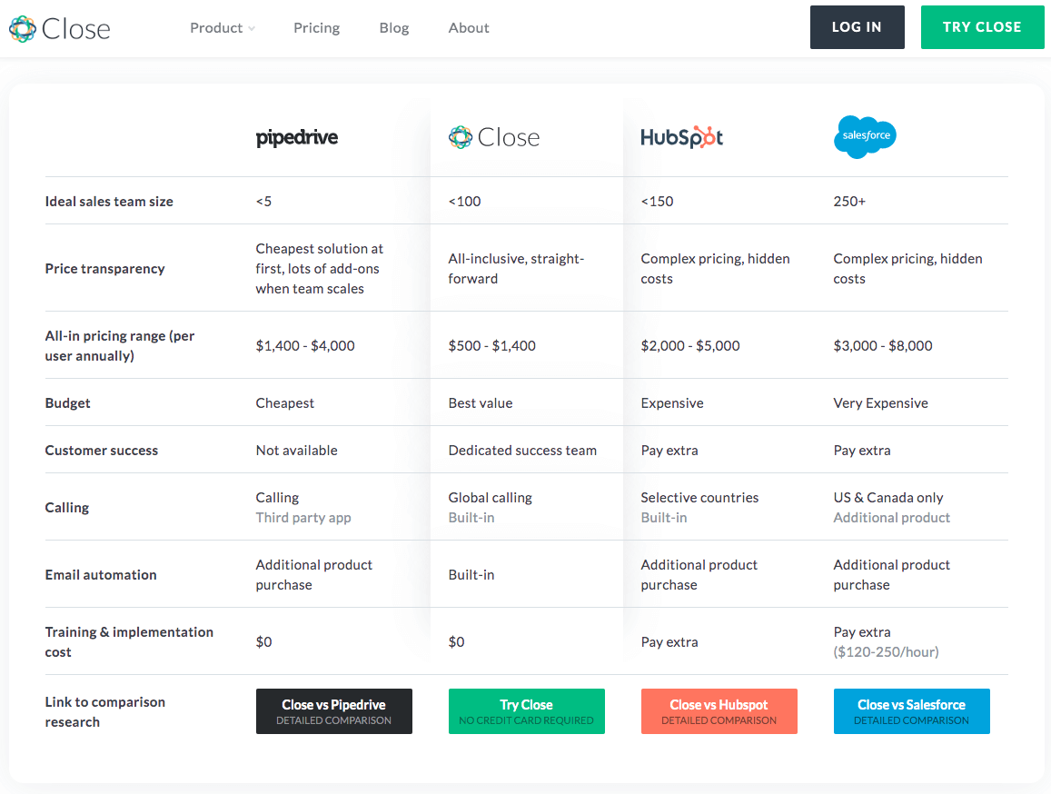
How Close.io compare themselves to other CRMs.
It's not all about the price you could show your support hours compare to a competitor you could show if you have live chat support and they might only have email support.
Also a comparison is your chance to show your weak points. There are going to be times when your business is not suited to a particular company and you can highlight that in a comparison chart to indicate the clients you don't want.
This comparison chart below is again from close.com and you’ll notice they highlight where they're a little weak. They're clearly showing the companies that they are not suited for.

How Close.io distinguish their exact customer.
Chapter 8

Clear, Transparent Pricing
In 2021 expect to see a lot more subscription payments. YouTube are now pushing it with their music and premium subscription.
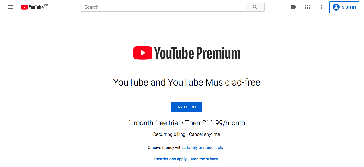
YouTube premium pricing example.
Apple TV and Apple News+ are now asking for subscriptions. It's not this recurring payment is a new thing is just a more people are switching the pricing model of recurring revenue.
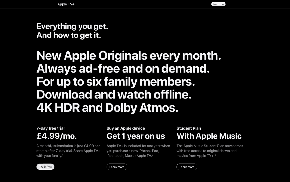
Apple TV+ premium pricing example.
Whatever you do on your sales pages or website don't make it hard for the visitor to find your pricing. On our homepage we use anchor links to people who can jump straight to pricing when they click a “get started” button.
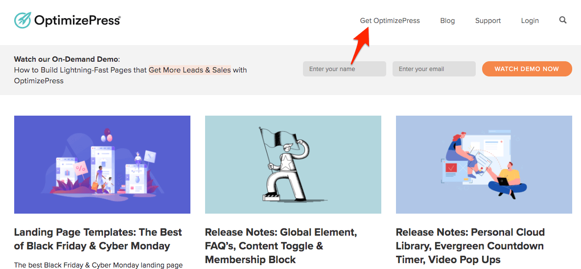
How we make it easy to buy OptimizePress.
Don't be afraid to show the pricing. Your sales page should do the work of presenting the value of your product.
If you do this well the buying decision for the user should be fairly easy.
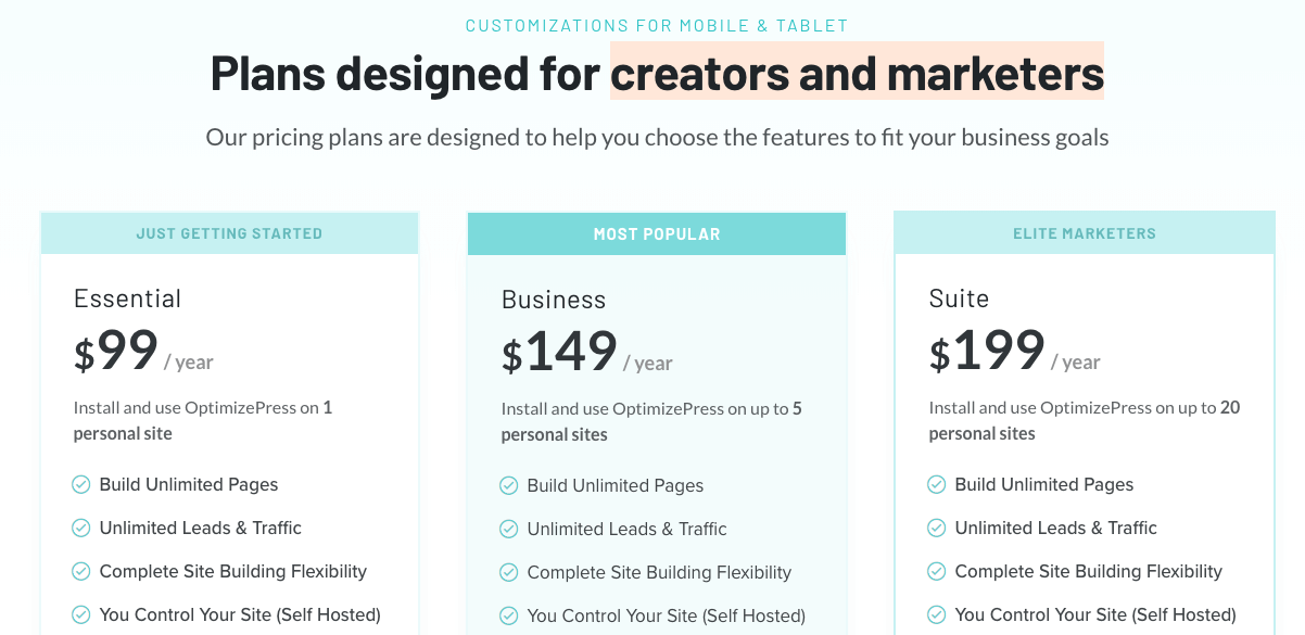
Our own pricing table with highlighted package.
To encourage that process you can highlight your most popular packages, you can offer free trials, highlight if you don't require a credit card for a free trial and show moneyback guarantees badges.
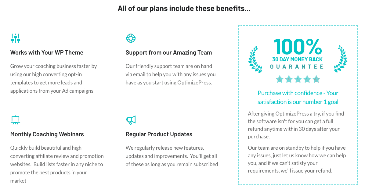
Our own example of showing a guarantee.
Chapter 9

Minimal Design
This is a trend is often seen represented by minimal black and white designs with very few colours. We'll see more pages with lots of whitespace around the key areas and those sites that want to use colour it'll be one or two very bold and bright colours stand out.
Just take a look over the Intercom home page you can see there already position themselves with the minimal black-and-white style, and bright colours that pop out in areas they want you to focus on or read.
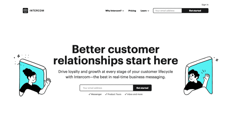
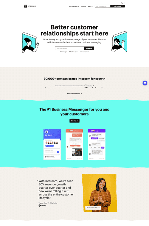
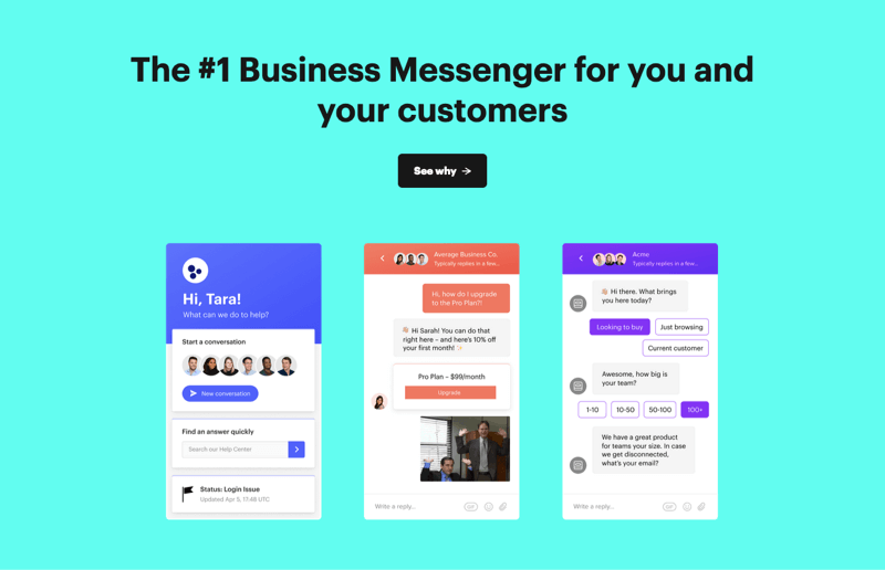
Another example from Curve banking start-up in the UK they use a very minimal black and white design with pops of red colour throughout.
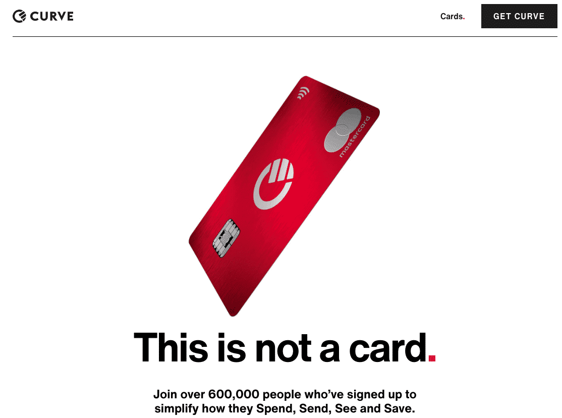
Minimal design from Curve banking startup.
Try and apply the same principle to your landing pages where you keeping the page clutter free but use that drop of colour to make buttons standout or a bullet list to be highlighted.
Expect to see this minimal theme applied to your landing pages where you may have one strong and powerful image with very minimal text and call to action.
Your landing pages don't have to be only text, remember an image can make a impact on the page and keep it minimal at the same time.
Chapter 10

Oversized & High Impact Typography
Expect to see large fonts not just in the headline but also in the body typography. The use of large fonts doesn't just make it easy to read it allows you to make a clear message that's more prominent on the page.
Innovators in the SaaS World, Basecamp, have recently reworked their homepage landing page to include bold, oversized type throughout the page. Even their navigation bar font is using an extra-bold typeface for additional impact.
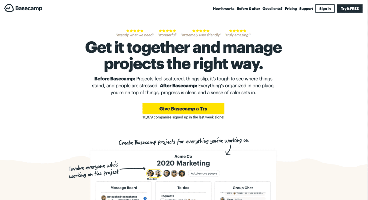
Bold oversized font example from Basecamp.
Using oversized and bold typography grabs visitor attention fast and demonstrates the sales or marketing message of the page clearly.
Chapter 11

Illustrations
Illustrations have made a strong comeback in recent years and this will follow through in 2021 with more illustrations style graphics on landing pages and sales pages.
We've seen an increase in the use of character graphics (sometimes called vectors) that are used to capture visitor attention in new and unique ways
Using illustrations is a great way to convey your marketing message or idea in a simple, easy to interpret way.
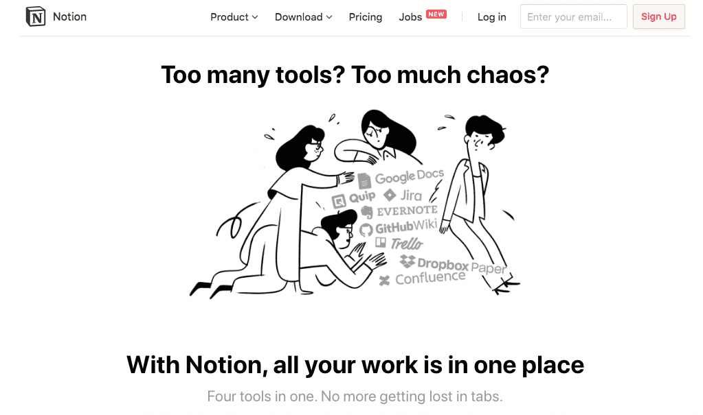
Notion uses illustration to show the overwhelm of using many tools
Custom illustrations help keep your page clean, give your content space and enhance the readability of your content.
They don't always represent any kind of feature or benefit but they look stylish, modern and help add colour to page.
While there is no real benefit of an illustration to highlight the product feature at the same time they can help keep the focus on the page content and lead the visitor through to your conversion goal.
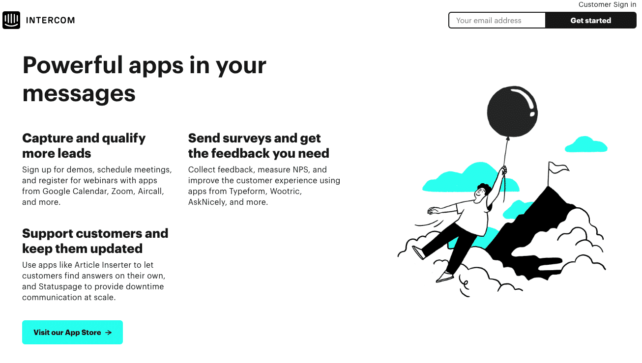
This illustration from Intercom doesn't show a specific feature but adds character to the page
Although custom illustrations are a great way to add unique flare to your pages, there are now more resources than ever before for you to source high quality illustrations at little or even no-cost.
If you're considering the custom illustration route, design showcase website Dribbble is the best place to start. Here you'll find many amazing artists and graphic designers showcasing their designs - just look for the "hire me" button on their profile if you find someone you'd like to work with.
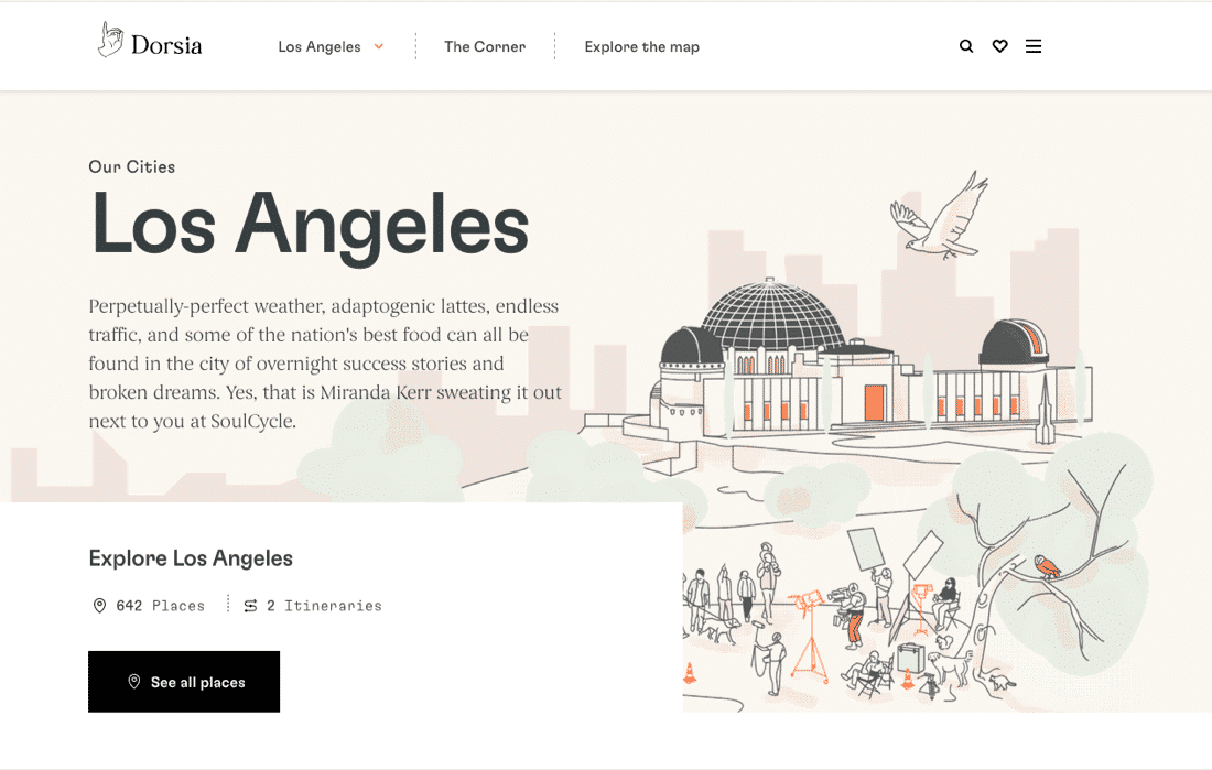
Dorsia uses illustration to differentiate itself from the imagery of most travel sites
There are also many designers and illustrators available on the usual freelance marketplaces such as Upwork. Be specific with your requirements and provide examples when posting projects to ensure you get a design style that matches what you're looking for.
We've compiled a range of resources for free and low-cost illustrations to help you get started with using illustrations on your landing pages...
Chapter 12

Clear Menus
We are not a fan of menus being used on landing pages. Remember a landing page has one goal, usually to collect the name and email.
By adding a menu this allows people to click away and go to other pages within your site.
However, we do know that people still need to add other links on those types of pages.
If you must use menus on your landing pages keep them very simple, even reduce your menu down or make a custom menu that includes maybe two links so people could navigate back to your homepage or even through to a content page (e.g. your blog).
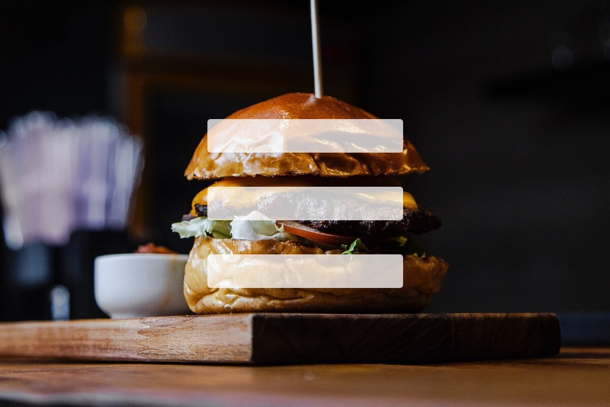
Use the hamburger menu on both desktop and mobile. This menu simply adds the three– marks as navigation on the landing page to keep it minimal but the links are still there if people were to look for them.
Look at this example of GoDaddy showing the hamburger style menu on desktop size layout.
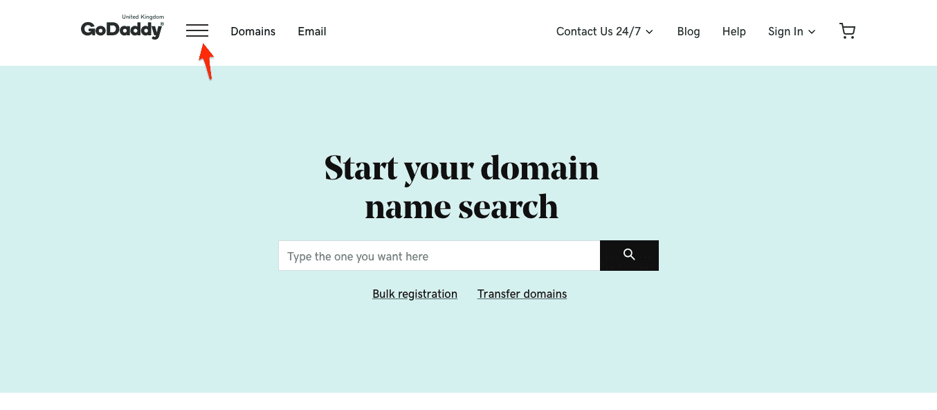
A desktop hamburger menu on the GoDaddy site
We created a menu element in our page builder to allow custom menus and hamburger style layout in case you ever wanted to add a menu to a landing page.
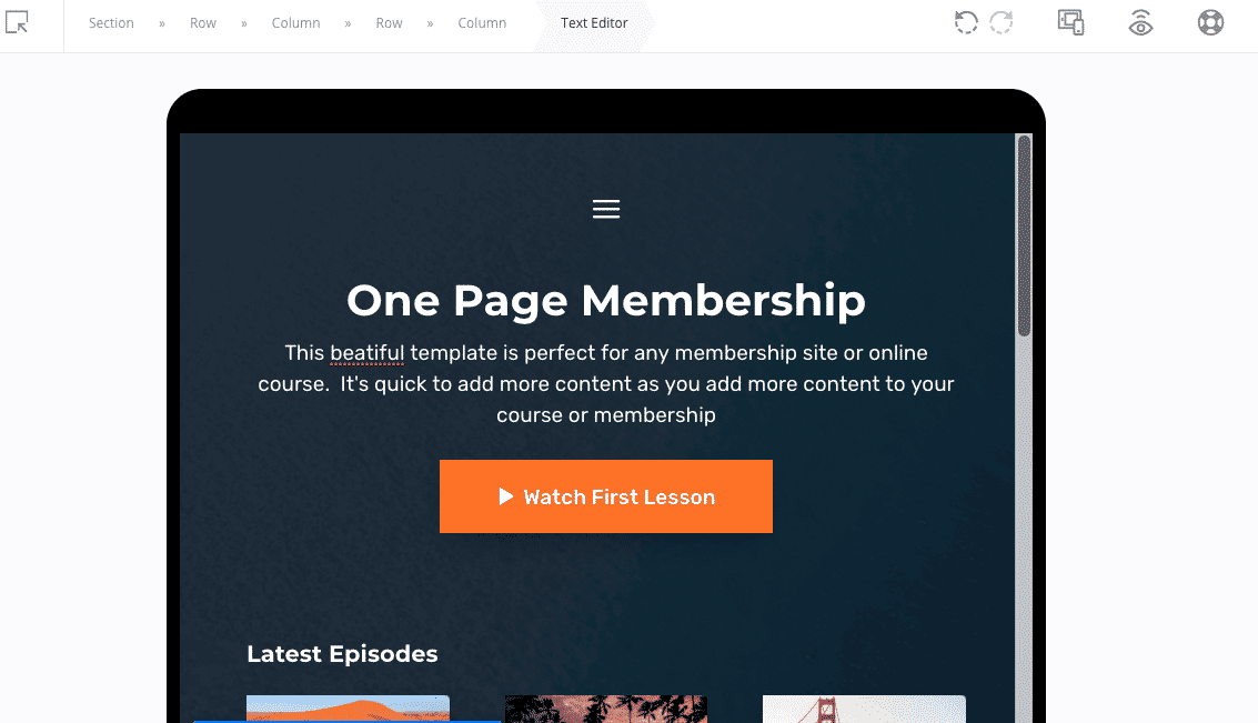
Our menu element create hamburger style completely mobile responsive.
We created a menu element in our page builder to allow custom menus and hamburger style layout in case you ever wanted to add a menu to a landing page.
Chapter 13

Regulations Compliance
Cookie laws and privacy policies are not going anywhere.
As much as they hinder our experience when browsing the web - cookie bars, popups and boxes are pretty much a requirement no matter where you're operating your website from in 2021.
Whilst remaining compliant is important, (consult your local laws for requirements that apply to you), there are some creative and innovative options out there for satisfying cookie requirements on your own websites.
We're likely to see even more innovation in this space throughout 2021.
There are many services that have different styled boxes that allow you to give the same cookie message notice with about obscuring content.
With a quick look at our most regularly visited websites, we found four different styles of cookie notice, so there are many different approaches to this...
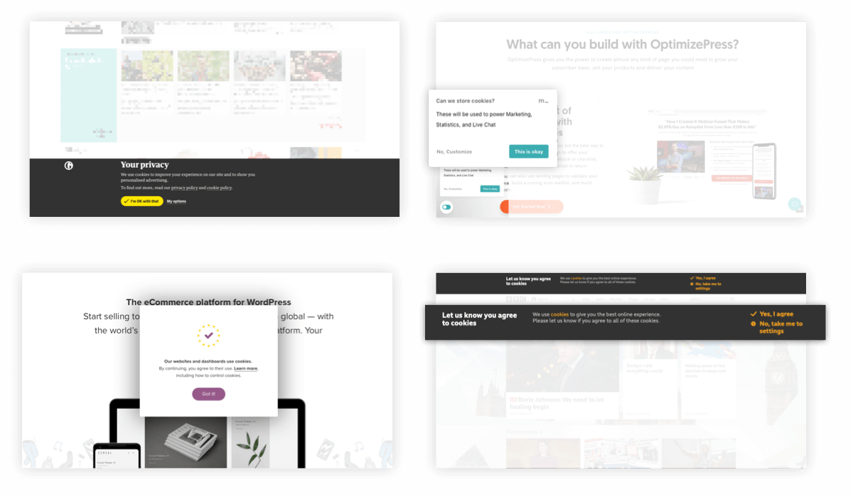
Different cookie bar examples.
On our own site, we’re using a service from Metomic (free tier available) which creates a unique box design that we positioned to the bottom left corner. We wanted something that gave the user the options they need, without being intrusive.
Chapter 14

Landing Page Trends to Ignore in 2021
This guide wouldn't be complete without our thoughts on the trends you might want to consider ignoring in 2021...
Our focus here at OptimizePress is on conversion - that is - getting better results for your business through bettter landing pages, sales pages and marketing websites.
With this focus in mind, there are some trends that might look "cool" but really won't help your site convert more visitors into leads and leads into customers.
Non standard navigation
We're all creatures of habit, and we like familiarity. This is also a factor when considering our web browsing habits.
Traditionally, we are used to the navigation on a website to be at the top of a page. Moving this to other locations on the page (although it might look cool) will often cause confusion - which leads to higher bounce rates on your landing pages.
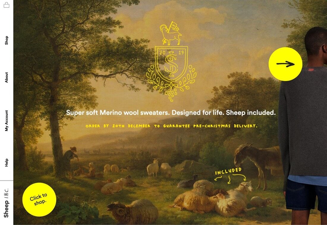
Left hand side navigation example.
In this example from Merino Wool Sweater company SheepINC, the navigation has been moved to a vertical sidebar, and they've also hijacked the usual mouse controls so using the scroll wheel navigates horizontally.
It's understandable to want to make your website unique and different (the website looks great) but always consider the user experience and focus on how easy it is for your visitor to flow through to your intended conversion goal.
Autoplay Video
We've known for a while now that UX (User Experience) on your landing pages and websites can affect how your pages rank in the search engines (particularly in big daddy Google). The idea of this is fairly simple - Google wants a better user experience for anyone landing on pages from their search results.
So we should always be considering how the elements and content we add to our landing pages affect UX.
Autoplay videos have long been the scurge of regular web browsers, and in recent years Google and other web browser developers have started to disable autoplay code from working on web video players.
So when developing your landing pages, I'd like to consider a couple of alternatives to autoplay video (particularly because if you do use autoplay on the page it's likely to be stopped anyway)...
Video in a manually triggered popup - In the example below from one of our OptimizePress landing pages, we use our Popup Overlay feature to create a video popup, and allow this to be triggered by a button on the page.
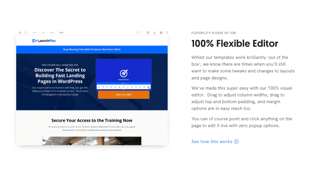
Video popup element in OptimizePress page building.
By doing this we not only give the user a better experience (as we are not forcing the video upon them) - we can show a larger video in the popup, giving more clarity to the feature we're showcasing.
We can also then use the autoplay inside the popup to start the video when the popup is triggered, giving the user a seamless video experience.
Muted Looping Video with Autoplay - A common trend you can consider instead of a traditional autoplay video, is a deliberately muted video with autoplay embedded into your page.
In the example above we actually combine both of these strategies, as we show a short looping video showing the flexibility of our editor, and allow the visitor to see more information (in the video popup) if they are interested.
Muted looping videos are not blocked by web browsers and are a great way to display features of your product or service without being intrusive.
Time to take action
Now it's time to take what you've learned in this guide and put it into action.
We recommend taking just one or two of these strategies to start, and consider implementing them or testing them on a few of your own landing pages.
We look forward to hearing your stories of how these affected your business and look forward to helping you succeed with landing pages in 2021 and beyond.
Take action with these landing page trends using OptimizePress to create your own landing pages in WordPress
Copyright © 2010-2022 OptimizePress® · All Rights Reserved. Privacy Policy · Legal Information
New guide coming soon : Landing page examples

